Guide 1 of 3 — Reading Ocean Data
Understanding Water Clarity
Before temperature breaks, currents, or chasing offshore "numbers," every offshore trip starts with one simple question:
What kind of water am I looking at?
Satellite ocean maps aren't fish forecasts — they're snapshots of water properties. If you understand what those images represent, you stop guessing and start recognizing patterns that repeat everywhere in the ocean.
Two layers answer that first question better than anything else:
Chlorophyll and Kd490.
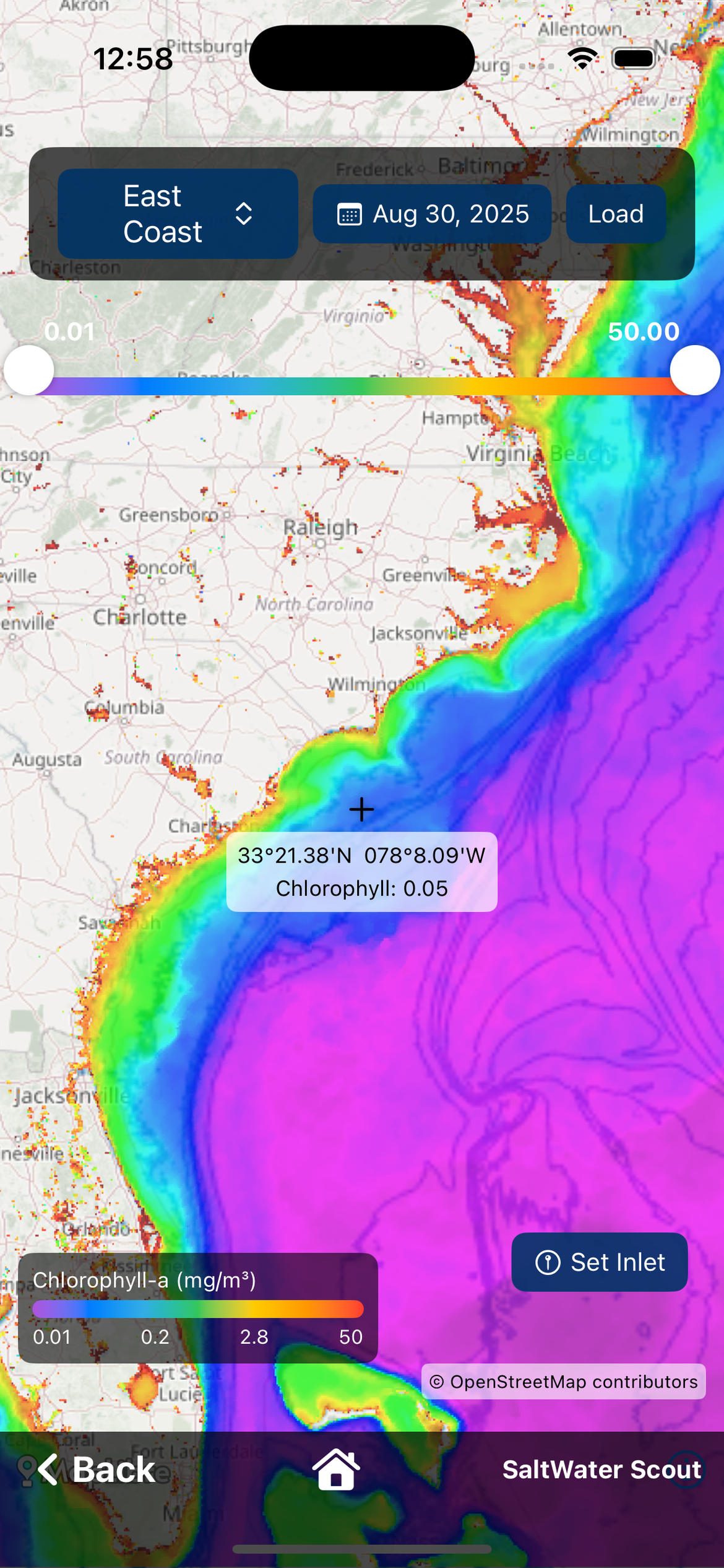
What a Chlorophyll Map Really Is
A chlorophyll image is not showing fish.
It's showing the concentration of microscopic plant life (phytoplankton) near the ocean's surface, measured by satellites that detect how the water reflects sunlight.
Why does that matter?
Because phytoplankton is the base of the marine food chain:
- Phytoplankton feeds zooplankton
- Zooplankton feeds bait
- Bait feeds predators
When you look at a chlorophyll map, you're seeing where life is being supported in the water column.
How to Interpret Chlorophyll Colors
On most maps, chlorophyll appears as a color gradient:
- Dark blues = lower productivity, cleaner oceanic water
- Lighter blues, greens, and yellows = higher productivity, more nutrients
This does not mean blue water is always better or green water is always bad. What it shows is different water masses — bodies of water with different origins, nutrient levels, and characteristics.
The most important thing on the map isn't the color itself. It's where the colors change.
Why Edges Matter on Chlorophyll Maps
When two water masses meet, the food chain tightens: plankton concentrates, bait gathers along the boundary, predators patrol the edge. That's why experienced offshore anglers don't fish "a color" — they fish the edge between colors.
On the map, look for:
- Sharp, defined color transitions
- Long fingers of one color pushing into another
- Narrow, well-defined boundaries instead of wide blends
Those shapes aren't random. They're structure — just like a ledge or contour line on a chart.
What a Kd490 Image Really Is
Kd490 is often misunderstood, but it's incredibly valuable once you know what it shows. A Kd490 image represents how quickly light is absorbed by the water. In simple terms: it's a water clarity map.
Satellites measure how much light at a specific wavelength (around 490 nm, in the blue-green spectrum) penetrates the ocean surface. Clear water allows light to travel deeper; murkier water absorbs light faster. Kd490 turns that into a visual layer you can interpret at a glance.
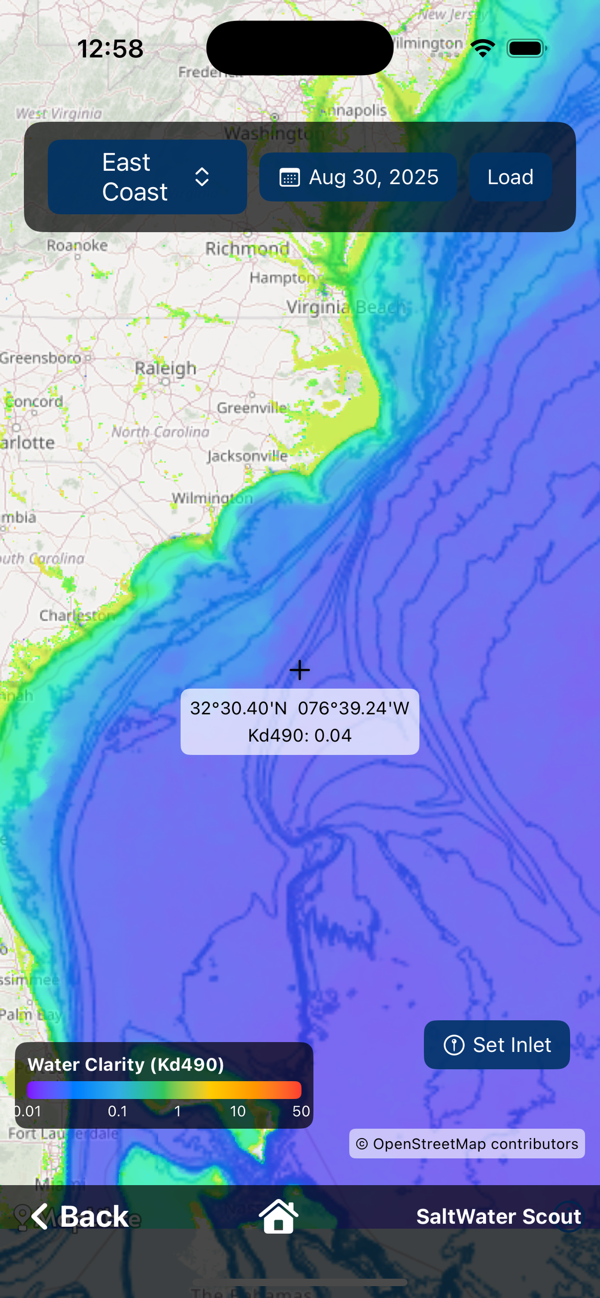
Why Kd490 Matters to Fishermen
Visibility is everything offshore. Many pelagic species rely heavily on sight to hunt. Clear water gives predators an advantage — especially when they're feeding along a boundary where bait is already concentrated.
Surface conditions can be misleading: sun glare, sediment, surface blooms, runoff. Kd490 helps you confirm what the water is really like below the surface, not just what it looks like from above.
Using Chlorophyll & Kd490 Together
Each layer answers a different question: Chlorophyll = Where is the food chain being supported? Kd490 = How clear is the water in that area?
When both layers tell the same story — especially along a boundary — you can trust what you're seeing. This is how you identify true blue water, real water mass boundaries, and areas where bait and predators naturally intersect.
A Global Way to Read the Ocean
The exact values change by region, season, and ocean basin. The patterns don't. No matter where you fish, the rule is the same: Compare the data. Start reading contrast.
Use the Chlorophyll and Water Clarity layers in SaltWater Scout to compare boundaries and clarity side by side with sea surface temperature. Download free for iOS and Android.